Redesign of a German Financial Website
Finanzvergleich is one of the well-known financial platforms in Germany that helps people compare financial products
01
Overview


Based in Munich, Finanzvergleich GmbH is a well-known platform in Germany that specializes in providing transparent and up-to-date comparisons of financial products, including savings accounts, loans, and investment options.
When I joined Finanzvergleich GmbH, my first project was to redesign their website with a modern, trustworthy look.
I focused on creating a minimal design with improved UX/UI relaying on user research, surveys, interviews, and data.
Location
Munich, Germany (on-site)
Goals
-
Increase Conversions: Boost sign-ups with banks by 15%
-
Build Brand Trust: Create a credible and reliable design
-
Improve Engagement: Increase scroll rates and interactions
-
Hosted signup: Introduce a signup for special offers
My Role
Research, UX/UI Design, A/B Testing, Surveys & Feedbacks
Tools
Figma (Design), Proto.io (Prototyping), VWO (A/B Testing)
Mouseflow, GA (Analytics)
Period
2022-2023
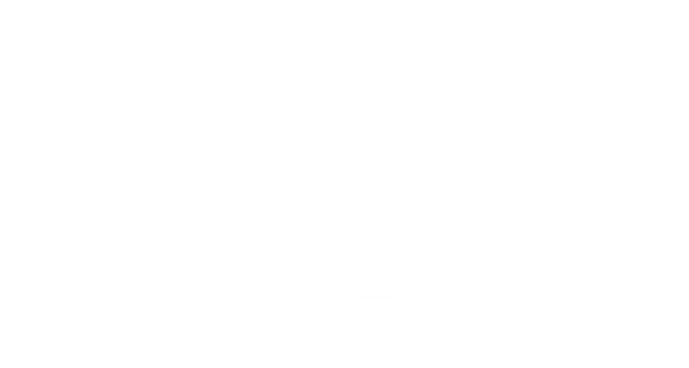
Part of the heatmap analysis I did of the previous homepage design
Insights
Before initiating the redesign process, I conducted a series of initial user interviews to gain a deeper understanding of the existing website's strengths and pain points.
The interviews revealed that while users could locate the products they were searching for, the process felt disorganized and inefficient.
Many participants described the website as outdated, with an interface lacking modern appeal and intuitive navigation.
the users expressed a strong preference for clear and upfront information about products, pricing, and availability.

03
Visual identity
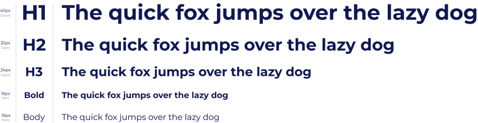
Typography
Montserrat is a modern, geometric font with a touch of playful charm, making it perfect for achieving a clean yet approachable feeling.
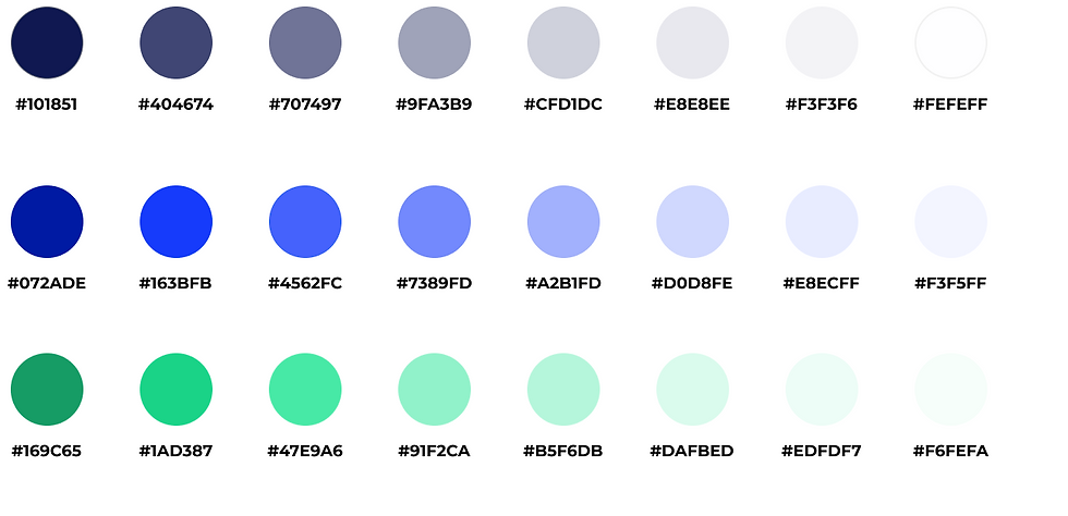
The primary color palette represents trust and reliability, making it ideal for the business and finance industry.
A wider range of shades was developed to ensure flexibility, especially for use in illustrations.
Icons
I chose a clean and minimal icon set with simple, elegant designs. As a base, I used the wide range of Ionicons library and added the Icon Set from Fintory to increase the variety of icons for financial-related topics. This approach ensures a consistent and simple style while covering various use cases, especially for financial topics.
Information Architecture
For this project, the brief required maintaining the existing information architecture, but the original site’s user flow had significant issues due to poor UX/UI design. While preserving the core structure, I identified and improved problematic areas in the user flow, enhancing usability and task efficiency.

Logo
The redesign of the logo took one month and involved weekly meetings with stakeholders and collaboration with an external designer to refine the overall concept. During brainstorming and sketching, I discovered a flowing combination of the letters "F" for Finanz and "V" for Vergleich, which also represent a check mark. This became the foundation of the new logo. Incorporating the primary and secondary colors brought the design to life, creating a modern and trustworthy look that reflects the brand's values.
03
UI Design
02
Why Redesign
Research
Visual design & Accessibility: The original website had some major issues. It wasn’t user-friendly or accessible, making it hard for people to find their way around. The design felt cluttered and outdated, and the user journey wasn’t clear, leaving visitors confused.
Conversion rate & ROI: Since the company relied on conversion rates for profits, it was vital to present financial products clearly and transparently, helping users make informed choices while boosting the company’s success.
Trust: The original design didn't inspire enough user trust. This was confirmed by +10 user interviews and an user survey which I conducted from beginning of the project. It was necessary to update the visual design and content, adding elements like customer reviews and product certificates.
Design Process
Define: Conducted user interviews and surveys, created user persona, user stories, and journeys based on insights and data, then defined problem statements to address user needs.
Research: Aligning business goals with user needs through stakeholder meetings, user research, competitive analysis to ensure an effective design that drives success.
Narrowing Down Ideas: Developing low/high-fidelity designs, collaborated closely with developers and PMs during design sprints.
User Testing: Defined testing goals and recruited participants, then conducted moderated and unmoderated tests, identified main issues, then reported findings to refine the product.
Each project I work on has unique briefs and constraints, requiring a specific design process. For this particular redesign, I prioritized regular sessions with the PMs and stakeholders to ensure we stayed aligned and on track. We kicked off with the research phase, where we aligned business goals with user needs through interviews, surveys, and deep research on the relevant financial topic. During the narrowing down ideas phase, we created low-fidelity and Hi-Fi mockups, wireframes, prototypes, and user flows, again collaborating closely with developers, engineers, and PMs to refine the concepts. The user testing phase followed, where we gathered valuable feedback from target users and iterated on the design to address pain points and improve usability. Our focus remained on creating a design that balanced user needs and business objectives, delivering a seamless and engaging experience. For the phase of releasing new features, like a hosted signup for certain financial offers, we adopted the lean sprints strategy. This allowed us to quickly test ideas, gather user feedback, and make iterative improvements in short, focused cycles. By working in sprints, we could rapidly validate the feature's impact, make data-driven decisions, and ensure that the final release met both user needs and business goals efficiently.


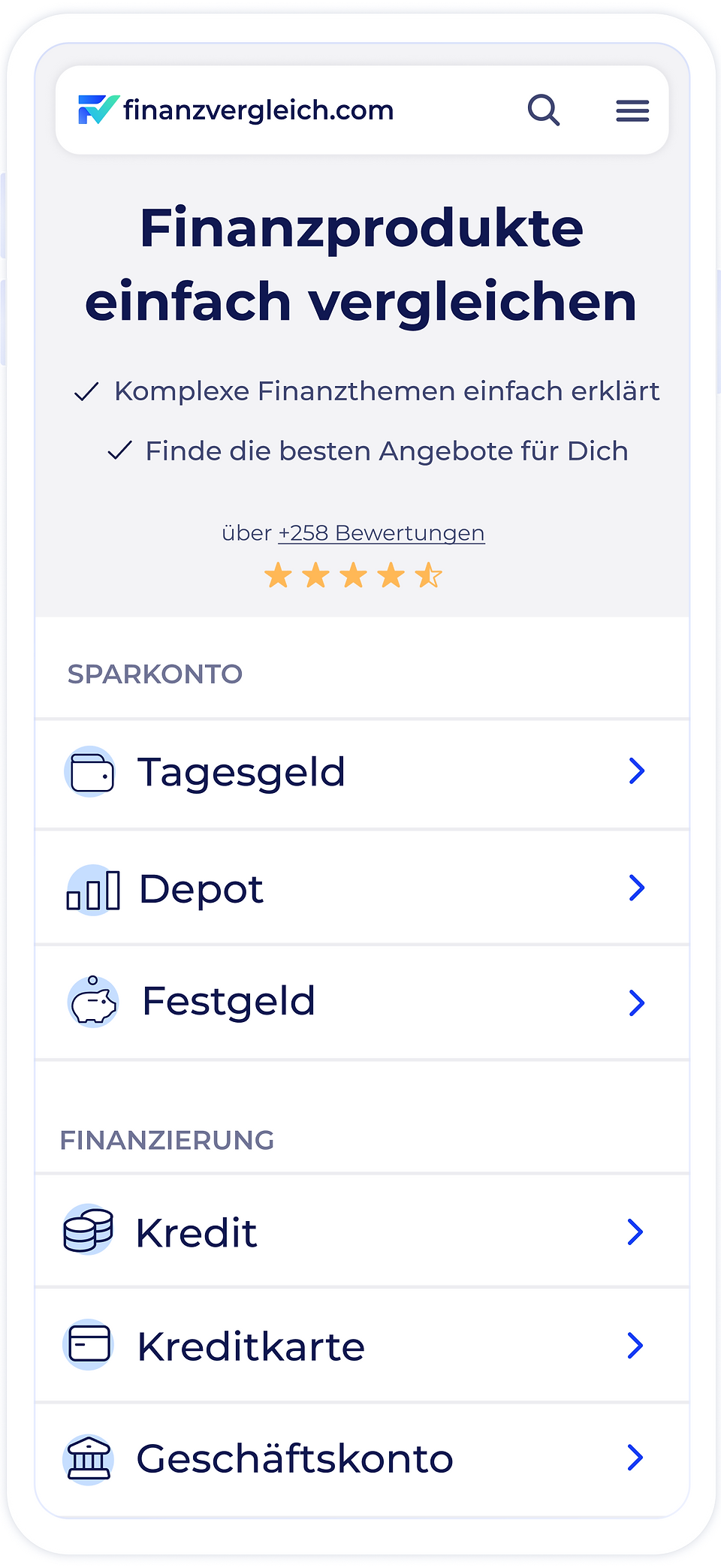
Homepage
The homepage, a key entry point for users, needed to establish trust and ensure transparency. To enhance the user journey, I tested variations of the above-the-fold category menu, ultimately adopting a card-like layout with small icons representing the main financial products.
I conducted an A/B test comparing the original above-the-fold design with the new category cards, proving that the updated user flow was significantly more efficient. The primary metric for evaluation—time taken to find the right category—showed a 25% reduction of the time, while the bounce rate decreased by 18%. These results confirmed that the design changes had a measurable positive impact on user behavior and overall site performance.
Additionally, I've conducted +10 user interviews, and participants shared positive impressions of the section, describing it as ''straightforward, minimal, and modern''.


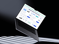

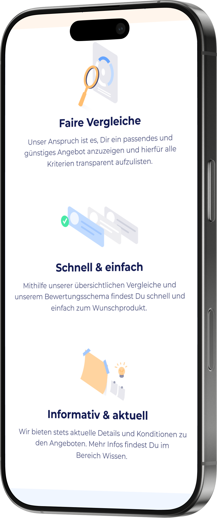
Mobile view of the redesigned homepage
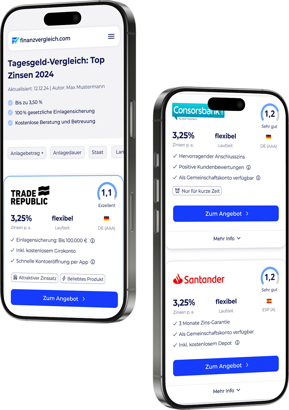

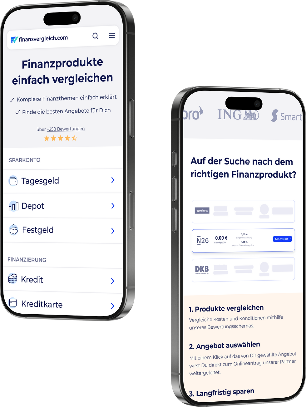
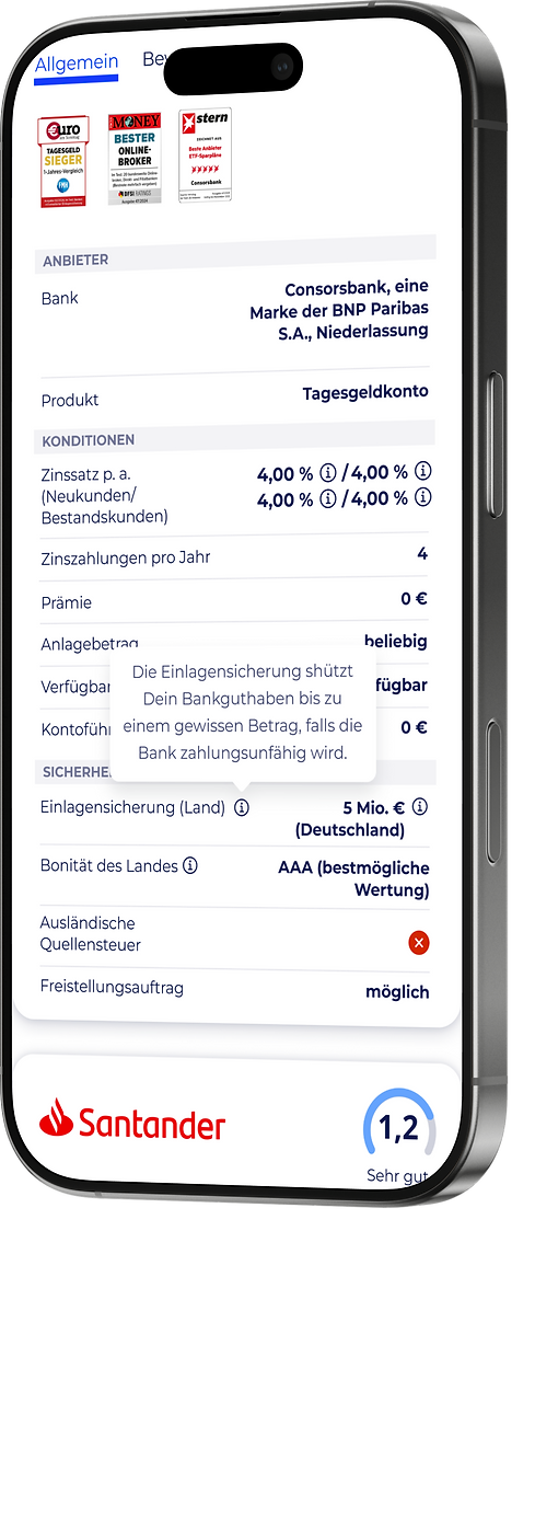
Mobile view of the redesigned product page
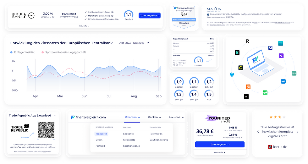
Components designed for the website
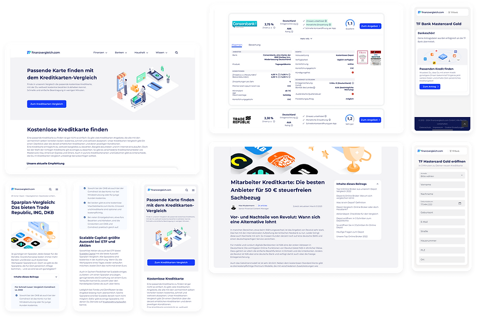
Screens designed for the pillar pages, articles and signup
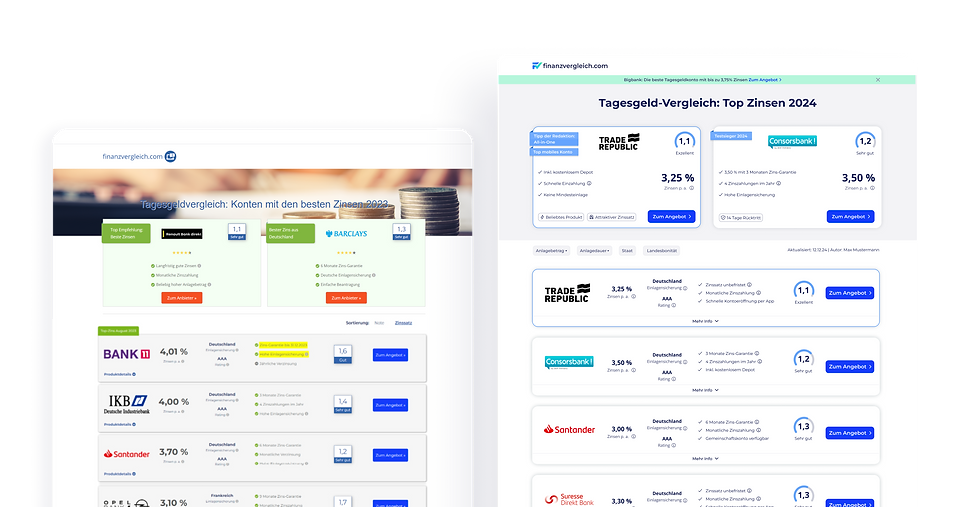
Product Page
After analyzing user behavior, I found that users often research on mobile but return to desktop to sign up and convert. This insight led me to focus on creating a seamless cross-platform experience. On mobile, I prioritized key features with minimal content, while on desktop, I offered deeper information to help users finalize their choices.
I designed over +10 product comparison pages, balancing clarity and functionality to help users find the best bank offers and drive conversions, all while keeping the design clean and intuitive.
Given the importance of these pages to the business, I've conducted +15 A/B Tests after implementation, integrating data-driven ideas to optimize the user experience. This resulted in a 22% increase in conversions, along with improvements in scroll rate, bounce rate, and user engagement.
"Think more, design less."- E. Lupton 💡

After: Product Page